Showing posts with label Balboa Island. Show all posts

Wednesday, September 1, 2010

Clean and Simple

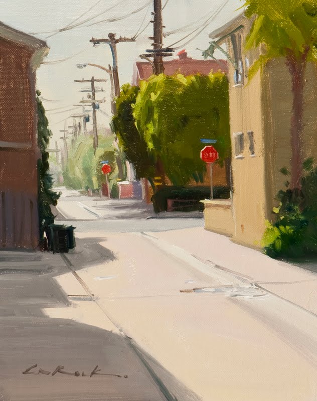
This is a painting from the “Just Plein Fun” plein air competition I participated in a few weeks ago. My 10x8 scene ­“Double Stop” was fortunate to received the third place award in the show. When I spotted this alley behind the main bayfront walk, I thought it would make a nice composition, but only if I kept it clean and ­simple.

I’m finding more and more the importance of clean color and simple shapes to drive my point home. By taking extra time in my decision making process, finding the right balance of shapes can truly make a painting sing without having to say everything.

In the past, I used to pride myself in how fast I could crank out a painting or that I could just set up anywhere and capture a scene. With those hasty decisions came hit and miss results. Sometimes I’d nail it, but more often they became either average works or fell apart when I reviewed them them the next day. The more I’ve slowed down over the years, the happier I’ve become with my results.

Once I saw that this alley had potential I spent about 20 minutes visually composing it. I moved up and down the alley every 100 feet or so trying to find the right balance of shapes. I narrowed it down to three spots, then spent another 15 minutes reviewing each of those until the above view was chosen. I felt that the combination of the simple concrete foreground making up the bottom third balanced well with the mass of trees and shapes of the homes. By painting the bottom third with very little detail, it lets the eye easily glide up to the trees. Once there, I used the complement of the green trees with the red stop sign for contrast and a focal center. The bottom left shadow was created to slow the eye down as it guides you in along it’s “S” shape. The house details were kept to a minimum, using the “L” shape of the one on the right to hook you in. The second stop sign was added as a supporting focal point as well as the telephone poles. They were both set up to create depth, letting your eye glide back into the scene. As you recede in to the distance, I used the left side home to hold you in. The silhouetted trash can shapes then direct you back to the stop sign and complete a circular loop.

I kept the colors of each area clean by carefully painting individual areas separately, not letting any of the color “mix” on the canvas. I used a soft synthetic flat that held its edge well and took my time with each shape. With this approach, you can say so much with very little. Enjoy!

Monday, February 1, 2010

Hierarchy

I just finished up a three-day workshop here locally and we were very fortunate to have some beautiful weather wedged between last weeks deluge and the new storm days away. Many thanks to all of you who attended. As is my norm, I’m usually in a reflective mood immediately following the teaching and since my voice is shot, typing seems to be the best way to convey thoughts as of the moment. So this 12 x 20 plein air alley scene above, “Pearl Stop,” will be my subject on focal hierarchy.

One of my beliefs in setting up the structure of a painting is the creation of a focal interest and its supporting cast. One way to view this is to imagine a pyramid, with my main subject of the painting being at the apex and my simple, quiet areas forming the base or foundation. Without foundational elements, my focus would topple and without a star element, the work would be unfinished. How much or little I develop these areas depends on the scene, but I’ve noticed that if I construct a poor-quality pyramid, my painting is usually unsuccessful.

In “Pearl Stop” I was obviously faced with a busy subject, so my foundational support section had to be made up of smaller elements than usual. But by grouping these together, I was able to create a larger visual shape by painting several items in one consistent value. I combined the far left hedge, closest portion of the street and far right telephone pole into one unit. My base section of the pyramid is now the “U” shaped foreground that’s all in shadow. I minimized detail here to move your eye past this element to my focal apex of the white fence, flowers and umbrella, and thus the completion of my two extremes. As I proceeded with the rest of the painting, all other elements had to fit in between to make the larger to smaller tiers of my pyramid. The next larger section is the red-roofed house and it’s counter-part across the alley. Then the centered tree shape, the distant structures, light bands across the street, smaller details of windows, trash cans, and center puddles, the telephone pole cross-beam areas at upper center and finally the stop sign. The stop sign then became a fun area to play around with. I painted it anchored in the foreground shadow, (my base), but contrasted it in the lighter area of the roof. This created a nice play of a supporting interest, and also forced a sense of depth. Now, I’m sure the actual hierarchy can be debatable person to person and depending on ones interests, but the basic idea should hold up. As your eye moves around the painting it will keep coming back to the more important elements and tend to gloss over the least important or foundational elements. All of this was achieved by working with my hard and soft edges and degrees of contrast.

I think I was able to a create nice composition and stop your eye where necessary, but I do live in California and our stop signs are only a suggestion. Enjoy!

Wednesday, August 19, 2009

Big Bottoms

Fresh off the Just Plein Fun show plus wrapping up my three-day workshop. I’ve noticed my appeal of a large simple weight at the bottom of a painting. As I study my contemporaries and look for my own compositions, this area interests me more and more as solution to not having a piece feel “top heavy.” I touched upon it briefly when teaching and thought I’d share my thinking.

While I enjoy low horizons in other artists works, I rarely find them appealing myself. I usually like to put my horizon in the upper half of the painting and use the weight of the land as an anchor. This has some built-in benefits that immediately work: One, the large shape gives the scene a simple bottom mass to rest upon (think of a matted painting .... the mat is usually cut with a thicker bottom width than the top and sides). And two, it creates a nice, easy entry up to the focus. I like to use some simple brush work or a directional line such as the buoy rope or mast reflection in the above two paintings to move your eye in. For me, this also creates a smaller focal area to worry about and plenty of breathing room around the subject. In the paintings above, it helped me from getting the boats too big and crowding the edges. It also allowed plenty of space for other items to support the boats, such as buoys, buoy lines, masts and rigging lines. I felt that including these better told the story especially when my subject matter was so simple.

In these two 12x9 paintings completed at the Just Plein Fun event, I tried not to get carried away with detail in the bottom portions. Trying to add temperature changes instead of value changes in the one with the large sand mass. On the single boat, I needed a bit more interest in the water since the boat was so subdued. I added a couple of highlights on the water ripples for added interest and eye movement.

So, in honor of Spinal Tap’s 25th anniversary ... “Big Bottoms, My Works Got ’Em.” Enjoy!

Next week: Paintings that go to eleven.

Friday, April 17, 2009

Perspective


I find that getting your perspective correct is key to having a painting "sit" properly and feel real. (Remember those perspective rules, and vanishing points from grade school, well they work!) I noticed when painting this 11x14 boardwalk scene on Balboa Island, there were a couple more little tools I like to use for added believability. 

First, when faced with a pathway, I usually have it enter the painting from at least two sides of the canvas. I chose to put the base of the red wall about a half inch up from the bottom left corner. This gives me a big entry for your eye at the bottom of the canvas. If the wall was extended down, and off the bottom of the canvas, the path would be too narrow and not as inviting. I try to do this in most of my paintings with roads or paths.

Next, I made sure all elements, even the little things were in perspective. The bench was tricky, but if you think of it as a box first, then cut out the negative space, it was much easier. Same goes with people, a little tip I learned was to line up all of your heads on a horizontal line. This keeps it so some people don't look like giants, or gnomes. Not everyone depicted plays in the NBA.

Lastly, I gave the background plenty of atmospheric "graying". This gets the work to have lots of depth and creates another avenue to move your eye down the path. Enjoy!