Tuesday, April 28, 2009

Eighty / Twenty


Just finished up another 3-day workshop last weekend. I thank all those who attended. As I was thinking about all the topics we covered, one that stands out in my mind is the 80/20 rule: 80 percent of a painting is unimportant and 20 percent is. It’s not to say that the 80 percent doesn’t matter, quite the contrary. This large portion is the foundation of a painting, your supporting cast that backs up the focal points and main interest. We can’t have every element matter, some areas are quiet and others command attention. By following this rule, I find that I can keep my paintings from “getting away from me”, with too much detail or being overly busy.

In “Fish Stories”, the painting above, that was my goal. Only the main white areas of the boat matter. Everything else was minimized by painting the values close and the edges soft. This large dark mass supports my focus, yet if you look close there is plenty going on, it just doesn’t overstate my main interest. 

I’ve always enjoyed paintings that reward you upon closer inspection. When you first see this painting, you only see the boat, but when you look into it further, then you see the guys working, the ropes and junk that make up a fishing dock. Just like a free dessert, unexpected but always welcomed! Enjoy.

Friday, April 17, 2009

Perspective


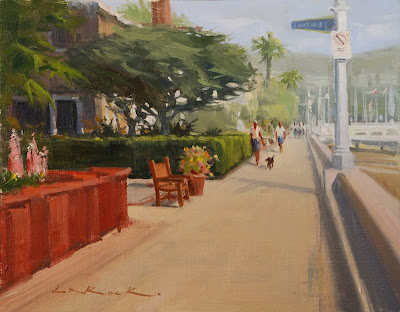
I find that getting your perspective correct is key to having a painting "sit" properly and feel real. (Remember those perspective rules, and vanishing points from grade school, well they work!) I noticed when painting this 11x14 boardwalk scene on Balboa Island, there were a couple more little tools I like to use for added believability. 

First, when faced with a pathway, I usually have it enter the painting from at least two sides of the canvas. I chose to put the base of the red wall about a half inch up from the bottom left corner. This gives me a big entry for your eye at the bottom of the canvas. If the wall was extended down, and off the bottom of the canvas, the path would be too narrow and not as inviting. I try to do this in most of my paintings with roads or paths.

Next, I made sure all elements, even the little things were in perspective. The bench was tricky, but if you think of it as a box first, then cut out the negative space, it was much easier. Same goes with people, a little tip I learned was to line up all of your heads on a horizontal line. This keeps it so some people don't look like giants, or gnomes. Not everyone depicted plays in the NBA.

Lastly, I gave the background plenty of atmospheric "graying". This gets the work to have lots of depth and creates another avenue to move your eye down the path. Enjoy!

Tuesday, April 14, 2009

Simplifying Complexities


In painting this plein air painting of the Beachcomber bar down at Crystal Cove, I was faced with a dizzying array of information. In the foreground we have bar stools, bar benches and bar tables all in the same honey-toned wood and to make matters worse, a complex railing in front of it all blocking most of my view (I eliminated). The entire bar was built of the same wood. Add a thatched roof (brown too). Then there was everything behind the bar: glasses, cash registers, bottles and all other bar paraphernalia, plus a bartender.

What drew me to the scene was the contrast of the bright cream umbrella against the darker wood tones. I thought that would make a nice focus. So, how do we approach everything else? It's the suggestion of elements that's the key. I took my time and hinted at everything that was unimportant in the painting. By not fully defining the bottles, benches and misc. stuff, your eye does not dwell on those elements. This allows you to keep coming back to the umbrella and secondary focuses of the bartender, and a couple of glasses here and there. I suggested plane changes in the stools and tables, kept my contrasts down in this area and in the areas behind the bar. The viewers imagination will fill in those details, but in the painting they'll pull together as large unifying shapes.

This 9x16 was painted in two sessions on the same day, morning and afternoon (I broke for lunch at the cafe there in-between ... burgers and coffee are essential to good plein air painting!) This was probably completed in about 4 hours. All of the time was spent on the nuisances, the focal areas only took about 20 minutes. Enjoy!

Sunday, April 5, 2009

Painting in Catalina

So, I'm going a bit backwards in time, but this was an exciting trip (at least for me). I had the opportunity to paint on Catalina island with fellow painters Jeff Horn, Michael Obermeyer and Jesse Powell back in February. We had access to most of the island and I was able to complete 10 plein air studies in three "paintable" days. This was all for the benefit of the Catalina Island Conservancy and each of us donated a painting to their annual Conservancy Ball to be held early this May. My 12x16 painting above "The Calm and the Jagged" will be up for auction to support the preservation of Catalina and the recent opening of the 27.5 mile Trans-Catalina Trail.

We started off our adventure out of Avalon and made our way back into the interior and found a nice eucalyptus grove. Then drove to Shark Harbor for an afternoon painting, and finished in Two Harbors for the night. The next day, after our pre-dawn painting above the Banning House, Michael and I made our way to Cherry Cove to do this scene looking north. Throughout the trip our weather was perfect, with calm seas and stunning clarity. All of the details on the mainland were visible from our vista overlooks, as was San Clemente island to the southwest.

After another painting down by the harbor we returned to Avalon for the evening. The next morning, before breakfast, we each captured the dawn's early light as it lit up the Casino and harbor boats. This little 7 x 11 plein air study (left) was used for the larger studio painting (below) a few weeks later. While working in the studio, I used the values from the study and the details from my reference photo to pull it all together in this 12 x 20 piece. You can compare the difference. The only thing I added to the final version was a reflection of the Casino in the foreground water. It wasn't there in the study or photo, but I though it added another dimension and enhanced the simplicity of the water. Also the foreground buoys would have been distracting if painted in full light like the others, so I knocked them back in shadow as to not draw your eye away from the more important elements. Enjoy!


Thursday, April 2, 2009

A Day in the Desert ... Borrego Springs


Well, I'm finally up with the times! I now have a new blog ... so thanks for visiting. I'll be posting periodically as I get the hang of this. Hopefully more frequently than not.

Two weeks ago, I was out in the Anza Borrego desert painting for their 3rd annual plein air invitational. It was a fun event, and good to see all the returning artists again. After a week of painting for the show, I decided to do a small experimental series titled "A Day in the Desert". Each of these three 6x8 paintings were completed in the exact same spot at three different times of day: dawn, noon and about 4:30 pm. Anza Borrego has some amazing color shifts throughout the day, and seeing the finished series is a reminder of how beautiful the desert can be. 

After each painting was completed, it was put away until the series was complete, so not to be influenced by what I had painted hours earlier. Enjoy!