Monday, November 16, 2009

It’s All Black and White


As I was finishing up my workshop this past weekend, I’ve been thinking quite a bit about the overall abstract shape in a painting. Most of the time, I don’t immediately recognize this or it just comes through naturally, but I find myself drawn to it more and more, especially when I notice it in other artists work. Edgar Payne was a master at composing it, particularly in his boat scenes. And a lot of other great painters utilize this as a foundation for their paintings. So here’s my take on it using a piece completed for the San Luis Obispo plein air event two months ago. The painting above, “The Cheryl Sea” is a 12" x 9" scene in Morro Bay, CA.

How I view the abstract shape is figuring out what the overall image would look like if you stripped it down to a black and white contrast. (I’ve done this to my painting in the insert as an example). When I view the composition in this way, I can visualize the effect of the light and dark relationship and whether it holds an overall dynamic interest. If this shape is pleasing, then the final painting has a good chance of success. I can do this quickly in my sketchbook before I start by blocking in the dark mass and adjusting the ­composition accordingly. Once completed, I’ll sketch this in on my canvas and position it so my focal area is where I want. As I begin the painting process, keeping my values in the same range will hold this shape together. Then I can simply alter the temperature and colors to define the different elements in the ­painting.

While I don’t think this holds true for every painting, looking for it and using it as an option has helped me discover scenes I might normally pass up. Enjoy!

Saturday, October 31, 2009

And Now for Something Completely Different

Just wrapping up the week here at the Sedona Plein Air Invitational in Arizona. We’ve had an unusual cold snap come through with some freezing painting temperatures. But all have managed to produce nice work despite our numb little fingers and frostbitten noses. Other than this weather anomaly, it’s truly a spectacular place to paint.

For growth as an artist, I feel you need to step out of the box and try something different to spur new ideas on a fairly frequent basis. Since painting is such a solo endeavor, I find this to be vital. No one is looking over my shoulder telling me to do this or that, so these little experiments have taught me a lot. Forcing me to open my eyes and look at things in a new way.

Driving around Sedona admiring these magnificent mountains, sculpted into a myriad of colorful peaks and spires. Their breathtaking beauty gets your mind swimming with ideas for paintings. I’m usually drawn to the shadows in scenes I end up painting, but here I was amazed at the color shifts in a fully lit mesa. Some of these flat lit expanses with very little shadow were intriguing and it got me thinking about color in a single value. I’ve always admired the work of Dan Pinkham. His understanding of color is far beyond most artists and yet his work is simply put in a subtly beautiful statement.

Which brought me to the painting above: could I paint a uniformly lit scene in one value step using only color to define depth and form. “Colorforms” above, was my 6x8 plein air attempt at that goal. For better or worse, I was amazed at the difficulty and could see how someone could spend a lifetime studying this approach. But I also gleaned a lot of useful information on how certain colors worked in adjacency to one another. I began with mixing one of the orange colors in the main bluff, trying to find a color that represented the form and yet sat in its place depth-wise. Then throughout the rest of the painting, it was a matter of mixing a color that worked but did not step up or down on the value scale of my original color note. I ended up being oddly pleased with my attempt and utilized some of the green combinations as a solution in my very next painting.

While I don’t think I’ll go in this direction as a painter, the study and change of pace was refreshing. I believe these exercises can pump new life in ones work. Color can be your friend, but you certainly need to work hard on that relationship. Enjoy!

Monday, October 19, 2009

My Wave, Baby

My apologies for taking so long to post. This has been an extremely busy time with three plein air shows in a little over a month, commissions to finish, and two good friends staying with us: artists Ken DeWaard and Jill Carver. So, I’ve had a few hats to wear!

With the close of the Laguna Invitational event yesterday mixed with spotty weather, I thought I’d discuss my approach to the beach and waves. Since I’m near the ocean, painting at the beach is a popular subject for me. But even as I’ve done my share, the ocean and its waves are endlessly challenging. The above scene, titled “Foam Rollers” was one of my Laguna entries, a 9x12 plein air painting on our first sunny afternoon late in the week. I usually prefer the afternoon here on the west coast as you get some nice shadows on the crashing waves. And with that, here’s my take on painting waves.

First up is composition: I like the juxtaposed angle of the incoming waves as opposed to the angle of the bluffs, if I have that scenery option. Both are little wedges that lead the eye into one another and that creates a natural “S” composition, which is the solution above. Next up is observation and study of the wave sets to choose what I want in my painting. There are several sea “events”: flat ocean, the start of a cresting wave, the wave just beginning to break, half breaking/cresting and a fully broken wave with a roll of whitewash. Once I’ve chosen (I mostly go with a mix of breaking and cresting) I sketch in my placement of the wave(s). Planning is critical for me to end up with good results. Next is understanding the shape. When you watch the ocean, it’s usually a jumbled mess. There are so many lights and shadows happening that it doesn’t seem to make sense. To simplify the process, I try to visualize the wave as a cylinder and how the angle of sunlight will create a highlight at the top, putting the whole side in shadow. I then observe a middle shadow color for the foam and paint it in. This unifies the shape without getting confused by the action of the surf. I’ll vary the blueish whites and purple notes to give it interest, then hit the top of the wave with a yellow/white highlight to create the top of the “cylinder”. Same goes for the cresting part, but I'll add a dash of lighter water color at the tip to give the appearance of light penetrating the wave. I also make sure the foam rushing in on the wet sand has a “thickness” to it by painting a shadow at the base. Adding touches of yellow and/or viridian in the whitewash helps keep the whites more interesting.

This approach to painting waves has given me better success in believability. Thinking of it as a basic shape keeps it simple, but I’ll spend a lot of time working on the little color and edge nuances to make it look and feel complex. Enjoy!

Tuesday, September 15, 2009

Decisions Decisions


Since people have commented on how much they enjoyed seeing the original photo as compared to the final painting and hearing the thinking process … here is another. This 12x11 studio painting, “The Breakfast Goers” was created from a poor image taken on my cell phone camera (left). While eating an early breakfast on a painting trip, I noticed the intriguing light quality, backlit figures and my thinking that I could do something with it. It would be a bit different than my usual landscape, but that was also the appeal.

I usually start composing a painting with the question “what to keep in” and “what to change” instead of “what will I delete.” After the keepers are chosen, the rest is omitted. Kind of like picking fruit at the store, you choose a select few and move on instead of sorting though the entire bin, setting the bad ones aside and seeing what your left with. My thought process went like this: Keep the figures, a few items on the table to tell the story and dramatically simplify the background so it highlights the figures. Next, I analyzed the people to see what made sense. When I’m working with figures, what they are doing has to feel right as a painting, and not just a depiction “as-is” in the photograph. So, with the man on the left, I positioned his arm on the table, instead of leaving it mid-air and made sure the bill of his hat and glassed contrasted in the light coming through the window. Next to him, the person is turned and facial features are unseen, so I painted it as if they were looking forward. The distant center figure is being lost in the wood around the window, so I moved that person forward slightly. And, lastly the man’s arm on the right seemed odd. Having him hold a mug of coffee felt more believable.

With the background, the figures on the left are sitting with their backs to a mirrored wall, this would be difficult to portray, especially with the poor information in the photo. So, I painted the windows in a simple flat wall mass. I also made the wall cooler in color so it sat well in the distance. I only kept the items on the table that would re­ad well or broke up other shapes, but enhanced the coffee carafe because that was important to the story. I kept the table color warm to keep it in the foreground and created my own light reflections based on the where the windows were positioned. I cropped the bottom of the painting so you only saw a slight edge of the dish, keeping the utensil to point into the painting. If I used the whole bowl and made the painting taller, my focal point figures would be pushed up too high in the scene. I utilized the foreground coffee mug for its size, perspective and the way it broke up the dark area under the table (great tips from Gregg Kreutz’s book). It also leads your eye upward, and I added a hint of a handle to make it clearly a mug.

I rather liked the fact that none of figures were interacting. It gave it that Hopper-esque feeling of loneliness that seemed to compliment well with my minimalist colors. Enjoy!

Wednesday, September 2, 2009

Depth and Atmosphere

Above was my award-winning painting from the San Clemente show two months ago. This 11x14 plein air scene, “Crystal Rocks,” was painted down at Crystal Cove beach in Laguna in the late afternoon. I love the great atmosphere that can pick up at this time of day. And if you hit a low tide too, the rocks can give you wonderful compositional choices.

The challenge for me is trying to capture the shear depth of the beach and bluffs. I love the golden haze, but it’s usually not that hazy in actuality. Value stepping and edge work becomes critical here. Making sure I get the right amount of hard to soft balances and utilizing a full value scale can make or break the illusion of distance. I started with a pencil map of where I wanted my rocks placed. In reality, they were pretty much as shown, but actual size, shape, distances between and whether they overlap were all adjusted slightly. I did this to eliminate repetitive shapes but also to create visual contrasts. For instance, the closest large rock on the left was enlarged so I could create the top white highlight and have it contrast with the dark rock behind it. Also, the second rock was raised a bit so the small wave behind it was visually “broken” and I could further contrast the whitewash with the right side of the rock. This gave me some nice focal points, plus created a sweeping arc that leads your eye up to the main splash on the rocks behind.

In the painting process, once I established my values in the foreground rocks, I made sure to make the mid-ground rocks lighter, and the far bluff even lighter than that. These conditions existed, but I pushed the values to create greater depth in the painting. Ditto for the sand and water. With the far bluff, I began on the right side, established a value I felt appropriate, and then gradually lightened it as I proceeded to the left and most distant part of the scene. The structures were painted as shadow and highlighted sides to suggest buildings but not drawing your eye there directly. I added the slightly darker cloud shapes in the upper left to force your eye back in the painting and lastly a handful of figures to complete the story.

Even in plein air, I find you need to adjust everything a bit to make a painting sing. Enjoy!

Wednesday, August 19, 2009

Big Bottoms

Fresh off the Just Plein Fun show plus wrapping up my three-day workshop. I’ve noticed my appeal of a large simple weight at the bottom of a painting. As I study my contemporaries and look for my own compositions, this area interests me more and more as solution to not having a piece feel “top heavy.” I touched upon it briefly when teaching and thought I’d share my thinking.

While I enjoy low horizons in other artists works, I rarely find them appealing myself. I usually like to put my horizon in the upper half of the painting and use the weight of the land as an anchor. This has some built-in benefits that immediately work: One, the large shape gives the scene a simple bottom mass to rest upon (think of a matted painting .... the mat is usually cut with a thicker bottom width than the top and sides). And two, it creates a nice, easy entry up to the focus. I like to use some simple brush work or a directional line such as the buoy rope or mast reflection in the above two paintings to move your eye in. For me, this also creates a smaller focal area to worry about and plenty of breathing room around the subject. In the paintings above, it helped me from getting the boats too big and crowding the edges. It also allowed plenty of space for other items to support the boats, such as buoys, buoy lines, masts and rigging lines. I felt that including these better told the story especially when my subject matter was so simple.

In these two 12x9 paintings completed at the Just Plein Fun event, I tried not to get carried away with detail in the bottom portions. Trying to add temperature changes instead of value changes in the one with the large sand mass. On the single boat, I needed a bit more interest in the water since the boat was so subdued. I added a couple of highlights on the water ripples for added interest and eye movement.

So, in honor of Spinal Tap’s 25th anniversary ... “Big Bottoms, My Works Got ’Em.” Enjoy!

Next week: Paintings that go to eleven.

Saturday, August 8, 2009

Compositional Placement

I recently completed a small series of koi paintings that always interest me for the opportunity to push color and explore compositional design. This was one of a couple of studio pieces compiled from a series of images I took at the Mission in San Juan Capistrano when their lily pond was in bloom. The above painting “In Circles” is 16x12 in size and I chose the vertical format for a different feel.

The fun thing about these paintings was that this scene is entirely invented. I used multiple photos with different elements and placed them compositionally where I wanted them. This provides many possibilities and is a nice change to all the plein air work I do. So, for this one, I chose to play up the circular elements, since everything is a circle in these scenes. I began by sketching in the lilies and started working them in an arc on the left side of the painting. I made sure to overlap some here and there for variety and also used the little V-shaped stem areas to direct your eye. I placed the main lily flower in the upper “golden” third quadrant as a focal statement. I then drew in the large black koi in the bottom right to curve you back into the lily pads. I also enjoy the fact that you don’t see this fish upon first glance or from a distance, once you get up to the painting, this koi becomes apparent. The other two koi were placed to complete the swimming circle. These two were just invented from memory. Next were the water reflections. The blue of the sky was to be my main weight at the bottom, then I wanted to create a greenish brown foliage reflection to diagonally come down the right side and create a complimentary arc there that opposes the lilies. All the vertical reflections were added to break up the circles. And lastly planned was the water ripple to complete the theme.

The painting basically painted itself. I just tried to keep everything simple in the beginning and added detail towards the end. I pumped up the foreground color for extra drama and made sure to gray out the lilies as they receded in space. I was conscious of my edges to give focus where needed, soft in the distance and harder in front. Lastly were a couple of small color splashes for little bits of matter that are always floating on the surface. I used this for my secondary eye movement.

Sometimes it feels good not to be such a square. Enjoy!

Thursday, July 30, 2009

Editing Confusion


Just returned from the always fun Easton Plein Air event out in Maryland. Above is one of my entries for the competition, “The Mildred Belle”, a 9x16 painting of a historic Chesapeake Bay “Buy Boat” that caught my eye on this overcast morning during the event. This boat was used as a middle-man for oyster and crab fishermen to bring their catch to market in the early 1950s.

I was drawn to the wonderful cool whites against the gray blue water and was interested in seeing if I could capture that effect. The trick was eliminating all of the confusing background that competed with the boat itself. I’ve attached my photo of the scene so you can see what was omitted. (This piece was painted entirely in plein air and my photo was only for documentation.) Good editing is always needed in any painting, but I had to be much more inventive for this one. The large lighthouse that was behind the boat was virtually the same color, limiting my impact of whites to contrast the boat. I deleted that entirely and used the red building behind it as a better shape. Its deeper rust color helped that small white piece of the bow to pop. I had to walk around the lighthouse, catch a glimpse of the red structure, then painted that in loosely from memory. It was the same on the left side of the scene with the other large boats directly behind. I deleted those too, but needed something in the distance to suggest the harbor, so I painted the two distant boats from a couple that were much farther to the left. I continued the green tree mass behind everything for added simplicity. Now I had a quieter, complementary background to support my main interest. I painted the Belle next but further omitted small, unsightly items such as the orange cooler and aft canopy, plus a few ropes and other items that were unnecessary. I added the American flag on the back and few more rust streaks, but pretty much stayed true to the ship.

The result was this simple portrait instead of a confusing mess of shapes. If we can’t see the forest for the trees, sometimes a beautiful scene can be overlooked. This was one time I didn’t mind that the sun never appeared. Enjoy!

Sunday, July 12, 2009

Italian Reds

Since I loved painting in Italy so much and thought the subject matter was intriguing, I thought I’d do something big for the Festival of Arts this year in Laguna Beach, CA. Above is my main show piece “Italian Reds,” a 48” x 36” studio version of my original plein air work posted before.

This painting was completed over three days in mid June using my photo references in addition to the on-site work. I decided to handle the approach similarly to the way I painted it before, by painting the cypress, distant trees and hills first. I broke out the big brushes for this one to achieve the fresh, painterly feel I felt I conveyed in the original 12 x 9. Once I had the depth, I proceeded to the poppy fields working back to front. I kept the distant flowers as a mass and balanced the reds and green in a harmonious fashion to read as a segue from the foreground to background. Next was the main focus area. I wanted a feeling of power and punch without describing every flower, so I loosely painted in general areas of red where the groupings were to be featured. I then went back into the green stem areas and cut into the reds trying to develop interesting shapes as I proceeded. I added the darker shadows to the underside of the flowers next to complete the forms. The poppies at the very bottom of the canvas were kept very simple and in shadow to support what’s above them and not to distract. Next was developing the focal flowers further by punching in some darks, and adding more variety and nuances to the colors. I introduced a secondary eye-movement by adding in the violet flowers. Last was the sparkle of highlights in yellow and other bright dashes to catch your eye.

This piece came together surprisingly smooth, but I think since I had a successful study to begin with, it made the large work fall into place readily. It was fun to have a piece with so much bright color, plus it contrasted nicely with the deep atmosphere. Now I can sit back and breath easy it with a glass of wine in hand. And as most Italians will tell you in regards to their drink preferences, “the best whites are red.” Enjoy!

Tuesday, July 7, 2009

Revisiting

Just returned from a successful Telluride, Colorado plein air show. It turned out nice since the torrential thunderstorms thankfully abated for the three days we had to paint, plus the two-day outdoor sale. In the short time we had, I was curious to find the scene from the front of my web site titled “Los Gatos.”

Normally, I first paint on location, then do studio pieces using the plein air versions as reference. This time it was the reverse. The painting “Los Gatos” was done from photos taken two years ago in Telluride. I thought it would be interesting to see how this would develop in plein air. Finally finding the alley after driving around for a while, I realized the light was all wrong. I spent the morning and afternoon doing two other paintings waiting for my alley to play out. At about 6pm the light was starting to rake across the structures and those cool shadow areas of the gravel and weeds were becoming wonderfully luminous. This painting is all about those strips of light, so I began by massing in the shadows that were already appearing. As the light began to diminish and hit the focal areas, I indicated those highlight color notes quickly. I wanted to make sure I knew the values before they disappeared. I finished off the shadows next, keeping them simple and then returned to the highlights to complete the painting around 8:30pm. In my original piece, I added the cats to finish a scene that seemed to need a bit more interest. In “Eight O’Clock Alley” above, the light contrasted so well, I felt the painting made the statement I wanted. That’s usually how I determine if a work is finished. Adding people or animals to this piece would take away from the beautiful light qualities that developed. In “Los Gatos” the highlights were more minimal and adding some cats gave the focal interest to lead your eye around.

In revisiting this scene, I chose a slightly different angle and canvas size so as not to just duplicate what was done before. I feel a painting has to be new and fresh each time, painted for the right reasons and not simply trying to relive past glories. Enjoy!

Monday, June 29, 2009

Quick Draw


I apologize for the delay in posts. Been busy after my return from Italy getting things ready for the Festival of Arts in Laguna this summer, Telluride Plein Air, commission finalization, etc. (It’s good to be busy ... I think!)

This past week was the local Paint San Clemente competition and above was my winning painting from the Quick Draw that started off the week. Since they extended the duration of the quick draw to 3 hours this year, I used the extra time to get down to their local pier and set up. And the threat of rain kept the normally crowded beach parking manageable.

When faced with such a complex subject as an old wooden pier, the most important thing is simplicity. First, I try to set up at an angle where all the pier pylons appear as a mass instead of from the side where they look equally spaced. This eliminates the temptation to paint them all the same size and distance apart which is not very dynamic. Then I massed in a general pylon color for the middle to distant underside of the pier gradually moving forward in space and intensifying my colors. I pulled down dark suggestions of where I wanted the closer pylons, rather than trying to draw exactly what was there. The idea is to get a good “feeling” of the pier rather than attempting to paint in every piece of wood. After the whole pier was massed in loosely, I moved to the water and sky. I painted in a rough aqua color for the water leaving the white wash areas for later in the painting. The sky was painted next as it appears with no revisions. Now that the canvas was filled, the trick to making it look believable without being overworked is a slow building process of nuances, varying the temperature and not the value in the large masses of the water and pier underside. The only real details in the pier are the just the small edge highlights. I finished with the whitewash of the waves making sure I carried them through the pylons and keeping the shadows more purple. Lastly, I added the side support planks that nicely move your eye down the length of the pier. With some light poles and suggestions of people along the top, the painting was finished.

These old structures can be challenging, but they make a great subject if you succeed. Enjoy!

Sunday, June 7, 2009

Seeing Red


Friday, we happened across an amazing field of poppies that put the prior one to shame. It was as if the ground opened up and oozed lava over the entire area. We couldn’t pass up the opportunity to capture this onto canvas -- a nice treat for our last day of painting.

I normally don’t sit when I paint, but in this scene the best view was when you crouched down and immersed yourself in the crimson pool. I wanted to show the layers of depth, not just in the field, but also in the distant hills. With so many flowers, I felt my best approach would be to invent a pleasing pattern inspired by the red. I started this painting by completing all of the far trees, hills and cypress first. Then I proceeded top to bottom with the poppies, choosing a grayish red for the back and intensifying as I moved forward in space. I varied the colors from red to orange to purple to give it a nice variety. Then, as that became more of a foundational color, I used bits of white and yellow to move your eye around, fading it as it recedes. To show the far village in the distance, I re-introduced a reddish tint to give a hint of warmth in the upper part of the painting.

Note: Using your drying box as a stool is not advisable if you enjoy circulation in your legs. Ciao.

Friday, June 5, 2009

Entry ... Italian Style


Here is an Italian-style entry gate that seem to be very popular in this region. Some are quite ordinary, but others such as this one above, seem ancient and are truly beautiful. They have interesting stone-work and feature decorative plaques, wrought iron rings and other adornments. As far as I could tell, they serve no purpose other than to mark the driveway to a sprawling property or maybe just to one-up the neighbor.

Since the entire gate is the main focus, I kept the other elements at a minimum. There were some complex trees, and an entire horse stable in the background which I eliminated. It was difficult to see the light direction on the form because of the stone color, so I forced the issue by painting a simple blocked in shadow on the front side and then a lighter color for the “sunny” side. It was only after these two colors were massed in, did I get involved with the subtle color shifts and textures. The iron rings were added last, but kept very close in value, so you’ll only see them on closer inspection. Good drawing was key to pulling this one off, plus a variety of edges.

Below is our group at another incredible dinner. Smiles everyone! Ciao.

Thursday, June 4, 2009

Market Day


It was market day yesterday, as we traveled into Siena for our painting excursion. I always find it a challenge to try and capture a busy, constantly changing scene such as this. But, I figure if you can pull these off it’s all downhill from here! So, as we plodded through the bustling market, I found an area off to the side with this great view of a meat and cheese vendor. 

The hardest part of a moving scene is deciding what moment in time do you capture? There are tons of people merging in, out, and making purchases, with the busy vendors trying to accommodate their requests. I find it best to watch the action for a while before deciding. As you observe, I look for the nuances that make up the action: People pointing to what they want, resting a hand on the counter with their money, leg and arm positions, clothing, accessories such as purses or bags, etc. Once I’ve determined what I’ll include, I sketch it in quickly with pencil on my canvas. Then I start the painting by keeping all of the elements loose and sketchy while working around each of the figures. After the whole scene is blocked in, then I move to the people. Each person is a combination of many as they come and go. As I see someone move or stand in a way of my original idea, I paint it in, one body part at a time. There is lots of invention here, and I find that you just have to keep manipulating until it looks believable. They just don’t hold still in plein air!

I also thought I’d share this little sketch of the poppy fields that are in full bloom this time of year. This was a 30 minute painting, 6 x 10 in size at the end of a full day. The colors were amazing and I just tried to get the essence of the scene before the van arrived to pick us up. Eddie Felson -- fast and loose!

Here we are ... poppy painters impatiently waiting to go to the gelateria! Ciao.


Sunday, May 31, 2009

Chianti Hills


Well, I’m finally abroad painting the Italian countryside. The Tuscan landscape is quite beautiful this time of year with nice warm weather and interesting skies but it’s very green. The workshop I will be teaching starts soon, but I’ve been working on a commissioned vineyard scene this past week. Looking forward to painting some town scenes after five solid days of vine rows. Plus, I’ve had to fill all my down-time with double espressos, prosciutto and Sangiovese, so its been a tough week.

Here is one of the views I found with these amazing flowering bushes that are a nice break from all the verde. Another feature I love are these tall Italian Cypress trees that are conveniently everywhere to break the horizontal horticulture. They’re a great simple shape, but still have subtle color shifts that keep them interesting. In this composition, I was trying to keep your eye bouncing from the yellow flowers on the left to the big cypress to the villa in the distance. I popped in more Cypress as needed to break lines and hold you in. Nothing like an game of visual pinball as your eye caroms back and forth on all the juxtaposed diagonals. Ahh the 70’s! Ciao.

Tuesday, May 19, 2009

Structural Concepts


Here is another painting from Sonoma Plein Air. “Morning at Ernie’s” was my submission for the main gala event. I’m always inspired by the works of Scott Prior and William Wray, and this place was right out of their playbook.

Ernie’s Tin Bar is an auto repair shop slash bar joint, in which I’m assuming you can get your car fixed and drink your way though it – an interesting concept. The best thing about this place is its character, a lean-to structure with mish-mash construction and lots of junk that begs to be painted. The toughest part of this scene was setting up. I’m across the street, wedged between the highway guard rail and a ten foot hedge, standing on an uneven slope, with barely enough room for me and my easel, and just four feet from a busy car and truck route. (Disclaimer: please don’t attempt this at home, plein air artists are trained professionals).

I felt this was the best angle for the composition. The framing of the white sign against the mass of trees in the background was extremely important. As was the large area of darks that make up the left side of the painting. This allows my white areas to pop and hold the focal interest. My overall success though, hinged on edge-work. I kept my straight lines extremely varied. It might look like it’s just a painterly way of working, but it was well thought out. By forcing the white sign pole to be imperfect, gave it the character I was looking for. Ditto for the roof eaves, guard rail and scrap metal storage rack. I painted all of the foliage as unelaborated simple masses so not to detract from the building. The silhouette of the oval sign holds your eye from all the angles sliding to the right. I adjusted the far fence and tops of the distant trees to counter-balance those angles as well. 

Or it just could be my hands were shaking so much from the trucks screaming by at 60 mph! Enjoy.

Monday, May 11, 2009

Go with the Flow


I just returned from the Sonoma Plein Air painting competition. It was a great experience with challenging weather, good crowds and a very talented group of artists. My friend and fellow painter Robert Sandidge won the Artist Choice award with a well-deserved entry. Thanks also goes out to founding artist Keith Wicks for his hard work in making the show such a success and honor to be a part of.

The week started out with rain, but you can always find an interesting subject if you look for it, as is what happened with “Puddle Patterns” above. I am never opposed to altering my original idea if the opportunity presents itself  and what started out as a simple road scene was completely revised after noticing the amazing sky reflections in the water.

Upon pulling over and trying to figure out the composition for several minutes, I walked around to see if there were other good views. Once I saw the puddles, everything changed. My idea of the road leading you up to the tree was revised to be the puddles. I used the dirt and grass to widen my entry into the painting. Then made the puddles smaller in size as they went back into space. As I was painting the reflections and enjoying them more, I decided they would become the main focus. The original focus of the tree was now secondary, so I kept it simple and everything else soft. I also juxtaposed the sky clouds to the angle of the mountain so your eye zig-zags down from the top. The hard edge where the road meets the dirt was varied so as not to detract from other important areas.

Taking my time to stop and smell the roses turned out to be a good thing after all! Enjoy.

Tuesday, April 28, 2009

Eighty / Twenty


Just finished up another 3-day workshop last weekend. I thank all those who attended. As I was thinking about all the topics we covered, one that stands out in my mind is the 80/20 rule: 80 percent of a painting is unimportant and 20 percent is. It’s not to say that the 80 percent doesn’t matter, quite the contrary. This large portion is the foundation of a painting, your supporting cast that backs up the focal points and main interest. We can’t have every element matter, some areas are quiet and others command attention. By following this rule, I find that I can keep my paintings from “getting away from me”, with too much detail or being overly busy.

In “Fish Stories”, the painting above, that was my goal. Only the main white areas of the boat matter. Everything else was minimized by painting the values close and the edges soft. This large dark mass supports my focus, yet if you look close there is plenty going on, it just doesn’t overstate my main interest. 

I’ve always enjoyed paintings that reward you upon closer inspection. When you first see this painting, you only see the boat, but when you look into it further, then you see the guys working, the ropes and junk that make up a fishing dock. Just like a free dessert, unexpected but always welcomed! Enjoy.

Friday, April 17, 2009

Perspective


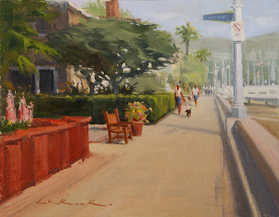
I find that getting your perspective correct is key to having a painting "sit" properly and feel real. (Remember those perspective rules, and vanishing points from grade school, well they work!) I noticed when painting this 11x14 boardwalk scene on Balboa Island, there were a couple more little tools I like to use for added believability. 

First, when faced with a pathway, I usually have it enter the painting from at least two sides of the canvas. I chose to put the base of the red wall about a half inch up from the bottom left corner. This gives me a big entry for your eye at the bottom of the canvas. If the wall was extended down, and off the bottom of the canvas, the path would be too narrow and not as inviting. I try to do this in most of my paintings with roads or paths.

Next, I made sure all elements, even the little things were in perspective. The bench was tricky, but if you think of it as a box first, then cut out the negative space, it was much easier. Same goes with people, a little tip I learned was to line up all of your heads on a horizontal line. This keeps it so some people don't look like giants, or gnomes. Not everyone depicted plays in the NBA.

Lastly, I gave the background plenty of atmospheric "graying". This gets the work to have lots of depth and creates another avenue to move your eye down the path. Enjoy!

Tuesday, April 14, 2009

Simplifying Complexities


In painting this plein air painting of the Beachcomber bar down at Crystal Cove, I was faced with a dizzying array of information. In the foreground we have bar stools, bar benches and bar tables all in the same honey-toned wood and to make matters worse, a complex railing in front of it all blocking most of my view (I eliminated). The entire bar was built of the same wood. Add a thatched roof (brown too). Then there was everything behind the bar: glasses, cash registers, bottles and all other bar paraphernalia, plus a bartender.

What drew me to the scene was the contrast of the bright cream umbrella against the darker wood tones. I thought that would make a nice focus. So, how do we approach everything else? It's the suggestion of elements that's the key. I took my time and hinted at everything that was unimportant in the painting. By not fully defining the bottles, benches and misc. stuff, your eye does not dwell on those elements. This allows you to keep coming back to the umbrella and secondary focuses of the bartender, and a couple of glasses here and there. I suggested plane changes in the stools and tables, kept my contrasts down in this area and in the areas behind the bar. The viewers imagination will fill in those details, but in the painting they'll pull together as large unifying shapes.

This 9x16 was painted in two sessions on the same day, morning and afternoon (I broke for lunch at the cafe there in-between ... burgers and coffee are essential to good plein air painting!) This was probably completed in about 4 hours. All of the time was spent on the nuisances, the focal areas only took about 20 minutes. Enjoy!

Sunday, April 5, 2009

Painting in Catalina

So, I'm going a bit backwards in time, but this was an exciting trip (at least for me). I had the opportunity to paint on Catalina island with fellow painters Jeff Horn, Michael Obermeyer and Jesse Powell back in February. We had access to most of the island and I was able to complete 10 plein air studies in three "paintable" days. This was all for the benefit of the Catalina Island Conservancy and each of us donated a painting to their annual Conservancy Ball to be held early this May. My 12x16 painting above "The Calm and the Jagged" will be up for auction to support the preservation of Catalina and the recent opening of the 27.5 mile Trans-Catalina Trail.

We started off our adventure out of Avalon and made our way back into the interior and found a nice eucalyptus grove. Then drove to Shark Harbor for an afternoon painting, and finished in Two Harbors for the night. The next day, after our pre-dawn painting above the Banning House, Michael and I made our way to Cherry Cove to do this scene looking north. Throughout the trip our weather was perfect, with calm seas and stunning clarity. All of the details on the mainland were visible from our vista overlooks, as was San Clemente island to the southwest.

After another painting down by the harbor we returned to Avalon for the evening. The next morning, before breakfast, we each captured the dawn's early light as it lit up the Casino and harbor boats. This little 7 x 11 plein air study (left) was used for the larger studio painting (below) a few weeks later. While working in the studio, I used the values from the study and the details from my reference photo to pull it all together in this 12 x 20 piece. You can compare the difference. The only thing I added to the final version was a reflection of the Casino in the foreground water. It wasn't there in the study or photo, but I though it added another dimension and enhanced the simplicity of the water. Also the foreground buoys would have been distracting if painted in full light like the others, so I knocked them back in shadow as to not draw your eye away from the more important elements. Enjoy!


Thursday, April 2, 2009

A Day in the Desert ... Borrego Springs


Well, I'm finally up with the times! I now have a new blog ... so thanks for visiting. I'll be posting periodically as I get the hang of this. Hopefully more frequently than not.

Two weeks ago, I was out in the Anza Borrego desert painting for their 3rd annual plein air invitational. It was a fun event, and good to see all the returning artists again. After a week of painting for the show, I decided to do a small experimental series titled "A Day in the Desert". Each of these three 6x8 paintings were completed in the exact same spot at three different times of day: dawn, noon and about 4:30 pm. Anza Borrego has some amazing color shifts throughout the day, and seeing the finished series is a reminder of how beautiful the desert can be. 

After each painting was completed, it was put away until the series was complete, so not to be influenced by what I had painted hours earlier. Enjoy!